Analysis of Ad: Ajmayen Syed

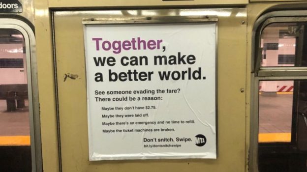
The speaker of the ad are the board members and head directors for the MTA. The speaker is trying to present themselves as people who don’t like to penalize for mistakes. By saying “Don’t snitch” it shows us that the speaker is trying to show us that they don’t believe snitching will change anything. They want to “help” us in a way.

The message that the ad is trying to convey is that you should not say anything if someone hops or passes through the MTA swipe areas. People go through tough times so they most likely have a reason for doing what they did. Also when they say “Don’t Snitch. Swipe” it means you should just try to help the person instead of ratting them out. By listing out bullet points of why a person most likely did not swipe, tells us that the MTA believes that people do not pay when they do not have the resources to get past. They want us to believe that doing so is okay however there are some things that do contradict what they are trying to say.

The intended audience for this ad would be the people in NYC who take the MTA. I know this because it’s telling the public not to snitch but rather help people who are trying to get past. They know that people have seen this several times and most likely people did have valid reasons in doing what they did so they just want people to know to help out instead of causing more hardship on people.

The strategies used to convey and persuade people would be the fact that they put up, reasoning into why people should help, and the color difference on the word “together” and the word choice of “better… world” help play a role in persuading people into taking action and try following what they are trying to say. Ethos is used when it says “MTA” on the bottom of the ad. This shows that this ad is credible and they MTA is trying to push forward what they are trying to say. Usually when you see MTA it means you follow what they say and in seeing that they put their credibility on the ad shows they are okay with people following what is being conveyed. Pathos is used as well when they list out the reasons why a person did not swipe. The list that they have created also consists of a lot of pathos because nobody wants to cause hardship to people who “laid off” or have “an emergency”. So the points that they listed play a role in using pathos effectively. Logos is used when they say “don’t snitch, Swipe”. They want people to help instead of causing more problems and when listing the bullet points first and saying that after, shows logically why people should help out.

I believe the ad is effective because I myself have experienced this first hand. Even my friends have. When we go somewhere we swipe for each other or just hop over because we don;t have the money and are just trying to get somewhere. Instead of having someone snitch i do feel it would be better if I received some help to get to where I am trying to go

Analysis of an Ad: Shane Benvin

The speaker of this ad is a company called “hulu”. Hulu is a website that streams shows and movies. By saying: “More shows & movies than your desire to go out tonight,” they’re trying to convince you that you’ll enjoy your time more at home watching something than going out. The ad presents themselves in a simple way by using their simple colors green and black.

The ad is arguing and trying to state that you’ll decide to watch shows and movies on their site more than going out. They are also claiming they have a lot of choices to choose from by saying: “More shows & movies.”

The ad relies on the assumption that you’re into watching movies and shows. The intended audience of the ad would be people who like staying home and watching things. Most likely this ad would attract high school and college students whom are usually taking the train every day for school or even work because it would help the time go by for them. I know this because most of my friends have a hulu accounts and are into watching a various shows and movies.

This ad is trying to persuade the audience by saying ”  More shows and more movies than your desire to go out tonight” which means hulu has a large variety of shows and movies that people can choose from and watch all night . They are trying to convince you that it’s better to watch hulu than go out.

This ad lacks ethos and logos but it has a little bit of Pathos. This ad shows alittle bit of pathos to persuade the audience when they said ” than your desire to go out tonight” because the word desire shows the emotional aspect of this ad. When people say desire it means a really strong meaning to have something.

I do not think this ad is very effective because I think this ad needs to stand out more. Maybe they can display some popular movies and TV shows that people have heard of so they would be more interested into buying Hulu.


Analysis of an Ad-Noah Fischer

The speaker in this ad is a company that helps you order food online from restaurants, takeout places and fast food and have it delivered to your house, the company is called seamless. The company tries to present themselves by using a comedic phrase and an image of the Statue Of Liberty with a slice of pizza to catch the reader’s attention and to let the readers know that they are a company that is related to food. They want the audience to see them as away to eat different types of food without even having to leave the house. I know this because in the phrase it mentioned that Chicago style pizzas were ordered a great amount of times in the state of New York.

The ad is trying to convey the message that seamless is an easy way to order food of any style. When you’re at home and in a comfortable position, no-one wants to have to get up and get a menu to order food or even get up to go out and pick up the food. Since seamless is an online service, you can easily order from your phone, without having to get up.

The ad’s assumption mainly relies on whether or not the person likes to eat out a lot or has access to the internet. Seamless is used to order food from restaurants and take out . A person that likes to eat cooked meals wouldn’t really find it as useful as a person who enjoys eating out would. Seamless is keeping up with modern technology, since most people use their phones all the time, seamless is more convenient for people. The intended people this ad was made for was everyone. Seamless wants everyone to start using their services for food since they are in competition with other online food services.

There are many ads for seamless that also even offer coupons or special deals. This ad in particular I found so appealing because New York is so diverse. In New York you can go down the block and find a Chinese spot next to a Turkish restaurant. So when the ad said “The Neighborhood with an identity crisis” I instantly thought to myself saying “That is such a New York thing”. The ad used ethos with the little picture of the State Of Liberty holding a slice of pizza, then it uses pathos when saying “The Neighborhood with an identity crisis “ because everyone that lives in New York knows how greatly diverse the food choices are. The ad uses logos with the follow up words “Based on the number of Chicago style pizzas ordered, come on this is New York” these words are used as evidence to show that New York is eating a different food style that is from Chicago.

I found this article funny and relatable but not effective. There’s many ways to order food and delivery that we have been using for the longest. There are other competitors who have more things to offer and are just more well known, Some of those other competitors are sponsored by take out places. It’s 2019 about to be 2020, most of these restaurants are all contactable by calling, there’s no real advantage to using an online service app. There’s probably less problems just calling your order in. At the end of the day, as long as I get my food I’m happy.


Analysis of an Ad: Sofia Castillo

The speaker of this ad is the app called Seamless. They are a food delivery service. They want be viewed as the best food delivery service in New York City.

The message in this ad is that New York loves to deliver and they are the way to go. At the top of the ad, it states, “NY ‘loves’ Food Delivery”. They are also trying to provide an alternative way to ordering food. Instead of making phone calls and have your order misheard, you can use the app.

One assumption that the ad relies on is that people hate making phone calls. The ad states, “Your favorite part of having a smartphone is near having to call anyone.” Another assumption that the ad relies on is that every time you call to place an order, they are often misheard. The last assumption is that everyone in NY always orders for delivery

The intended audience for this ad is for anyone in NY that likes to have their food delivered or anyone in general that orders food a lot. The ad states the NY loves food delivery.

In big letters at the very top, you see NY and the big red heart that you often see on souvenirs. They also try to appeal to those that don’t like making phone calls by stating, “Your favorite part of having a smartphone is never having to call anyone.” The ad also uses simple colors as well as the color red to make the app and the heart stand out. The ad also includes big bold white letters.

The ad appeals to both pathos and logos. It appeals to pathos because it is trying to convince the audience to start using this app to deliver their food. It also appeals to logos because there are messages in the ad like, “NY hearts food delivery” “Say goodbye to misheard orders”

I think the ad is effective because personally, I hate ordering food over the phone and I actually use a similar app to order my food. Also, I believe that a lot of people hate talking over the phone in general and this can appeal to them

Analysis of Ad-Keshona Sylvester

In this ad, the speaker is probably someone that works for the company Seamless. I came to this conclusion because the person that made the ad is trying to convince others to use the app Seamless. The speaker is presenting themselves as convincing. The speaker wants us to feel a little guilt trip into saving money on food by using Seamless. I know this because the speaker starts off by stating that we save money by “borrowing” our neighbor’s internet when we should save money on food.

The message that the speaker is trying to convey is that Seamless is a good app to order food online and save money while doing so. The assumption that the ad relies on is that we “borrow” our neighbors internet and we save money by doing so. 

I think that this ad is intended for young adults. Young adults are usually the ones big on the use of internet so they feel the need to “borrow” their neighbors internet because they might not want to or be able to get their own internet. For example, I always use apps like Seamless to order food because there’s always discount codes. On the other hand, the adults around me usually cook or go outside to get food. Also, young adults are more likely to want to order food online and save money while doing so. Adults can also be the audience but mostly adults that like to save money on things. 

A strategy that the speaker used is using real life to convince us to do something. The speaker uses Ethos as a way to persuade people to use the app. The speaker basically states that this app can save people money, giving credibility to the app. 

I think the ad is effective. I think so because no one can possibly turn down getting food delivered to them without having to go outside. Also, the majority of people like to get discounts to save themselves money on things.

Analysis of an Ad: Jalen Nimmons

The speaker in the add is a group called Rise. They are trying to present themselves as “activists”. A group of people trying to spread awareness of racism in America. I am able to tell this by the title “Don’t want to get stopped by the NYPD” as an African-American teenager in America. Also, as a young African-American witnessing other young African-American males being stopped and questioned by white police officers for no reason.

This message this add is trying to convey is African-Americans are the main victim of police harassment and that no matter how good or how rich you are if your skin is “black” you can always become the next victim of police harassment.

The intended audience is for the community especially young African-American males. They need to be aware of the challenges life has to offer them and what they may encounter while growing up in this world based on the color of their skin. Also, it’s used to gain unity within communities around the world dealing with this injustice.

One method of persuasion the ad used was the color “blue“. The color blue is associated to tears, hence sadness. This trigger in the brain can cause sympathy for the victim and the “cause”. Also, brought about was the fact that several African-American young males were stopped on the street and while driving for contraband or weapons and had neither were found. This indicated innocent males of color were stopped for one apparent reason, the color their skin.

This ad appeals to pathos because as you know some people are not able to walk away from police interaction alive. This message of people of color being targeted due to their color creates a lot of concern and worry within the African-American community and their homes. This ad appeals to logos by putting true statics of police stops and their finding mostly nothing in dominant black areas. This has ethos because these numbers come from the government of the year 2010 and not from the group Rise.

This ad is effective because it’s spreading awareness of the ugly truth in America, the ugly truth that racism still exists. It’s unfortunate that the legal system set up to protect citizens of America is the same system crippling African-Americans. We have to prepare our youth to deal with these challenges so they won’t become the next victim and hopefully gain enough support to change this on-going attack by cops who are sworn to serve and protect citizens of America not harass and sometimes murder innocent African-Americans.

Analysis of an Ad: Nevaeh Hoyte

The speaker in the ad is an insurance company known as “StateFarm”. StateFarm is trying to present themselves as the go-to service for renters’ insurance.  By utilizing a hypophoria, 

StateFarm answers their question with a simple but witty response. The simplicity correlates how they view their services: no hassle and logical. Additionally, StateFarm’s response, “Because your stuff’s worth it” is trying to emphasize they’ll make sure your possessions will be protected. 

The message the ad is trying to convey is with StateFarm your stuff will be protected. They want their customers to have the same satisfaction as they had when receiving the answer to their question.

Since this ad is on the train, StateFarm assumes that people who take the train are renters. Additionally, StateFarm assumes that the people on the train need renters’ insurance. It is safe to assume that most people who take the train daily rent an apartment. Furthermore, everyone who rents is susceptible to having their personal belongs at home damaged, stolen, or lost. StateFarm successfully takes advantage on their reasonable assumptions.

The intended audience of the ad would be people who are moving their stuff and are worried about any of it being damaged. When you move your stuff, you want to make sure it’s not being damaged. Also, since there is notably high fire incident rate in recent years, New Yorkers may need to look for affordable, quality insurance.

StateFarm utilizes their trademark vivid red and bold white letters in a large font to catch the eye of commuters. Additionally, by making a witty response to their question, it leaves an imprint on commuters minds, so when the next time they see an ad from StateFarm, they immediately recognize it. StateFarm effectively present themselves as the best provider for renters’ insurance. 

StateFarm has already established themselves as a reputable insurance company through previous campaigns. By giving an obvious answer to their question they are presenting themselves as the obvious service provider. StateFarm utilizes a short, straightforward statement in order to simplify the commuters thought process. StateFarm does not want potential customers to overthink an evident choice. Also, StateFarm reveals that people need renters’ insurance because they believe that peoples’ belongings should be covered. This shows that StateFarm cares and that they treat your items like it was theirs.

I believe the ad is effective especially for those looking for insurance when they’re moving their stuff. Through the ad StateFarm is showing that they are reliable and convenient. Also, the bold red background and white text catches the audience’s attention because it stands out.

Analysis of an Ad: Chelsea Mejia Figuereo

The speaker of this ad seems to be a company that sells high end perfumes by lower prices. The name brand is called Scentbird. The speaker is trying to get the audience to subscribe to their monthly plan and get fragrances throughout the month. They also try to lure the audience in with a catchy phrase, I get this idea because they have a big logo that says “WE’VE GOT THE HOOK UP”.

They assume that the reader knows English and knows designer brand. It tells the reader that they can ask about them, also making them seem more credible like hey if you don’t believe us you can always verify with our source. But they don’t really give a source or proof that their fragrances are 100% real. They assume that everyone will like their fragrances and that they know about high end phrases.

They also use imagery to show off their product. the image shows that the perfumes are small but also cute and have some sense of style to them. They show different colors such as pink, purple, green and blue. They have different variations for people with different styles.

I don’t find this ad effective due to the fact that it lacks information, it lacks details that will convey the audience to buy the product. The audience does not really have anything to compare this too or any real life information because just because they say that they have connections to designer fragrances it’s true. They aren’t giving reliable information or enough persuasive information.

Analysis of an Ad: Jafreisy Portes

The speaker in this ad could be a female or a company composed mainly of women who are trying to relate with other women about birth control. I think the speaker wants to be viewed as someone who understands women and the struggle that comes with birth control and trying to access it. I know this because of the font change in the word “Finally” which conveys the idea that it is about time that us women can access birth control easier and at our convenience.

The message this ad is trying to convey is that birth control is now accessible online and can now be delivered to you. It also is saying that this was something that should already be implemented based on the use of the word finally in the ad.

The assumptions this ad makes is that the main users of this website are females because the website is called “forhers.com” Another assumption is that whoever is reading the ad uses birth control or wants to be more informed about using it. It also assumes that woman want to start choosing their birth control online. As well as wanting it delivered instead of picking it up at a pharmacy. It assumes that women want a better way of receiving birth control.

The intended audience for this ad is females, which I got by reading the actual website name. Women who are sexually active as well as women that just use birth control for health purposes. I think this ad targets a wide range in ages. The ad could could appeal more to the younger crowd because of the use of technology. As well as appealing to the older crowd who have a busier lifestyle where having their birth control delivered is more convenient.

The strategies used in this ad is the word “Finally” being in a different font because it emphasizes that birth control being delivered and accessed online should already be a system put in place and is something woman have been wanting. I also think that using a period after every short sentence makes it straight to the point and simple which is exactly what the ad wants us to feel when using this website for birth control. The ad is straightforward just like the concept of the website.

This ad appeals to ethos and pathos. It appeals to ethos by using the word “prescribed” which is implying that you get the help of a doctor on this website when choosing your birth control. The use of a doctor gives this website more credibility. As well as appealing to the emotions of some women who feel they are finally being heard when it comes to better strategies in accessing birth control and making woman feel more comfortable about it. Especially when it can feel like it is just a mans world.

I do think the ad is effective because it is a topic most of us relate to. As females birth control is something we hear or learn about at one point in our lives. It impacts woman on the daily and the ad is basically sharing a website with us that makes us feel like getting our birth control got easier and more accessible. Which is something most women want. It is also being displayed in a subway station for many women to see constantly and on a daily. The ad is also effective because it gives a sense of comfortability especially to younger girls who don’t have the easy access to go to a doctor in person for contraceptives.